Split complementary color scheme
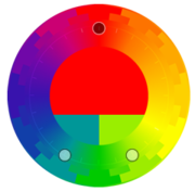
Split-complementary is a color scheme using one base color and two secondary colors. Instead of using a complementary color, two colors placed symetrically around it on the color wheel are used. The base color is main, while the secondary colors should be used only for highlights and accents. We get a combination of one warm and two cold colors (or vice versa). Anyway, because there are two secondary colors, the base color in never so strong and clearly dominant, and this scheme is better cold-warm balancable than a complementary color scheme. Various monochromatic shades of all colors could be added to the scheme.
Unlike the “sharp” complement, this scheme is often more comfortable for the eyes, it’s softer, and has more space for balancing warm and cold colors. If used in a design, the meaning of secondar colors should be precisely defined – e.g. one for active elements only, one for informative elements and highlights etc.
The important parameter of this scheme is the secondary colors distance. The closer they are, the more similar to the complementary color scheme will be the result. Though they have to keep some distance to be clearly distinguishable. The bigger distance there is, the more vibrant the scheme is. The extreme situation is when the distance is 120°, all three colors are distributed evently artound the color wheel and the scheme became a special variant: the triad.
Optionally, we may use also the complement with this scheme, as a Split complementary color scheme (accented) variant.
Examples
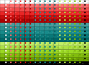
We can use the split-contrast scheme for palettes with very close, alike secondary colors, as well as those with more distinct hues.
Paletton usage
Within the Paletton application there is the Triade (3-color) option (without a complementary color), to create split-complementary schemes. It's the same option for both split-contrast and triadic scheme (as triadic is split-contrast with distance set to 60°). Set the distance from the base color complement by dragging one of those two supplement color, or by clicking the angle gadget and entering the value manually. The less the value is, the closer the colors are to the contrast color, and are more similar. The best values are typically between 15—30°. Higher values aren’t too suitable — except the shift by 60°, which makes the triad.


